Average Buyer VS Average Seller
Contact customer support at support@spxdirection.com
AVG BUYER VS AVG SELLER — Fullscreen Chart
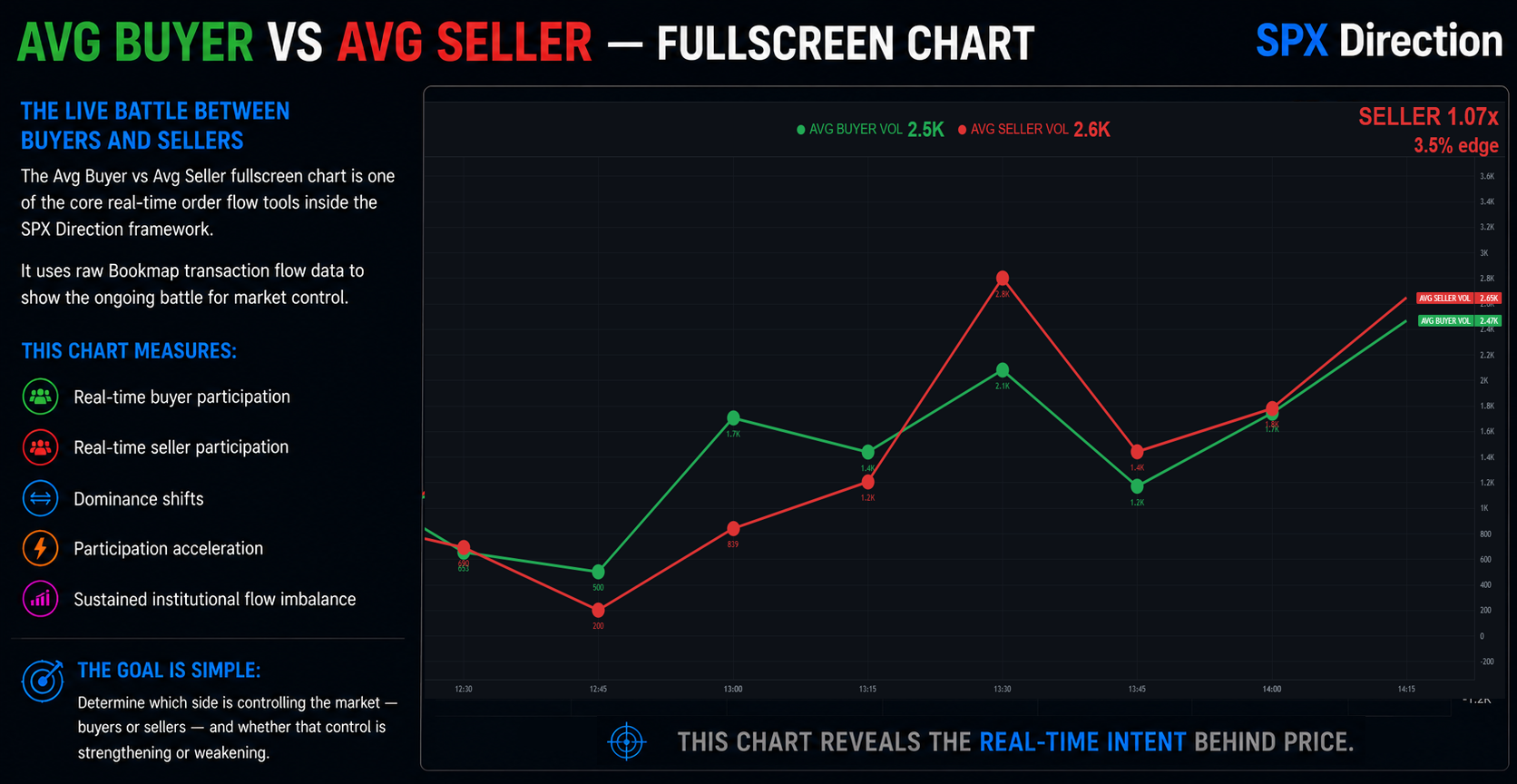
The AVG BUYER VS AVG SELLER fullscreen chart is one of the core real-time order flow tools inside the SPX Direction framework.
This chart allows members to monitor the live battle between buyers and sellers throughout the session using raw Bookmap transaction flow data.
Unlike standard candle volume indicators, this chart measures:
- real-time buyer participation
- real-time seller participation
- dominance shifts
- participation acceleration
- sustained institutional flow imbalance
The goal is simple:
Determine which side is controlling the market — buyers or sellers — and whether that control is strengthening or weakening.
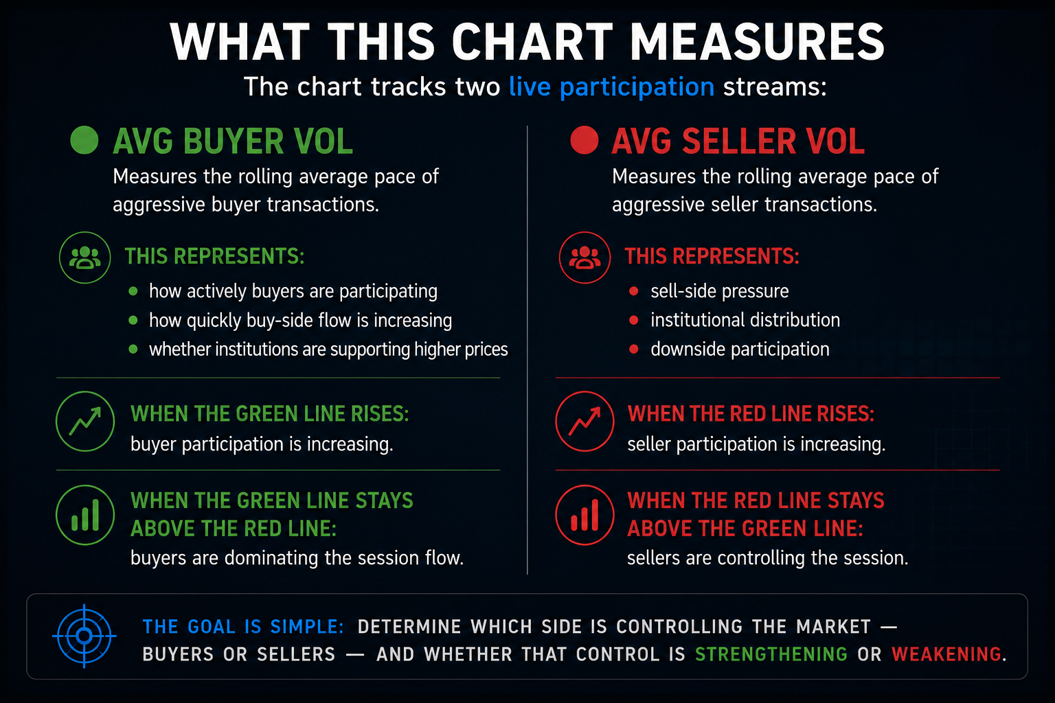
🧠 WHAT THIS CHART MEASURES
The chart tracks two live participation streams:
🟢 AVG BUYER VOL
Measures the rolling average pace of aggressive buyer transactions.
This represents:
- how actively buyers are participating
- how quickly buy-side flow is increasing
- whether institutions are supporting higher prices
When the green line rises:
buyer participation is increasing.
When the green line stays above the red line:
buyers are dominating the session flow.
🔴 AVG SELLER VOL
Measures the rolling average pace of aggressive seller transactions.
This represents:
- sell-side pressure
- institutional distribution
- downside participation
When the red line rises:
seller participation is increasing.
When the red line stays above the green line:
sellers are controlling the session.
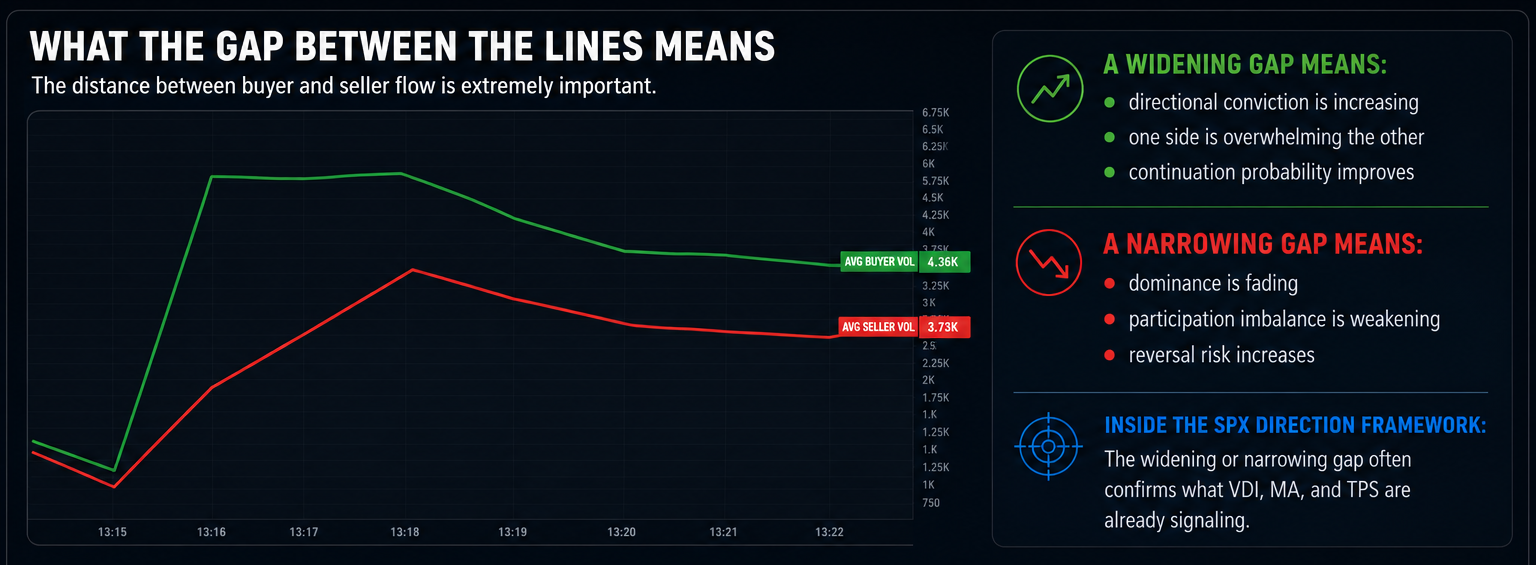
🧠 WHAT THE GAP BETWEEN THE LINES MEANS
The distance between buyer and seller flow is extremely important.
A widening gap means:
- directional conviction is increasing
- one side is overwhelming the other
- continuation probability improves
A narrowing gap means:
- dominance is fading
- participation imbalance is weakening
- reversal risk increases
Inside the SPX Direction framework:
The widening or narrowing gap often confirms what VDI, MA, and TPS are already signaling.
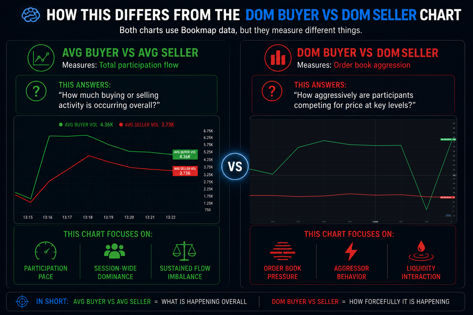
🧠 HOW THIS DIFFERS FROM THE DOM BUYER VS DOM SELLER CHART
Both charts use Bookmap data, but they measure different things.
AVG BUYER VS AVG SELLER
Measures:
Total participation flow
This answers:
“How much buying or selling activity is occurring overall?”
This chart focuses on:
- participation pace
- session-wide dominance
- sustained flow imbalance
DOM BUYER VS DOM SELLER
Measures:
Order book aggression
This answers:
“How aggressively are participants competing for price at key levels?”
This chart focuses on:
- order book pressure
- aggressor behavior
- liquidity interaction
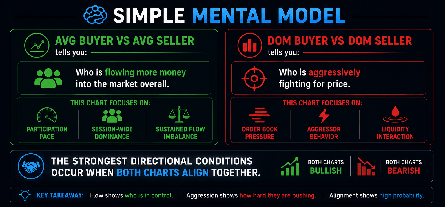
🧠 SIMPLE MENTAL MODEL
AVG BUYER VS AVG SELLER tells you:
Who is flowing more money into the market overall.
DOM BUYER VS DOM SELLER tells you:
Who is aggressively fighting for price.
The strongest directional conditions occur when BOTH charts align together.
🧠 DOMINANT SIDE LOGIC
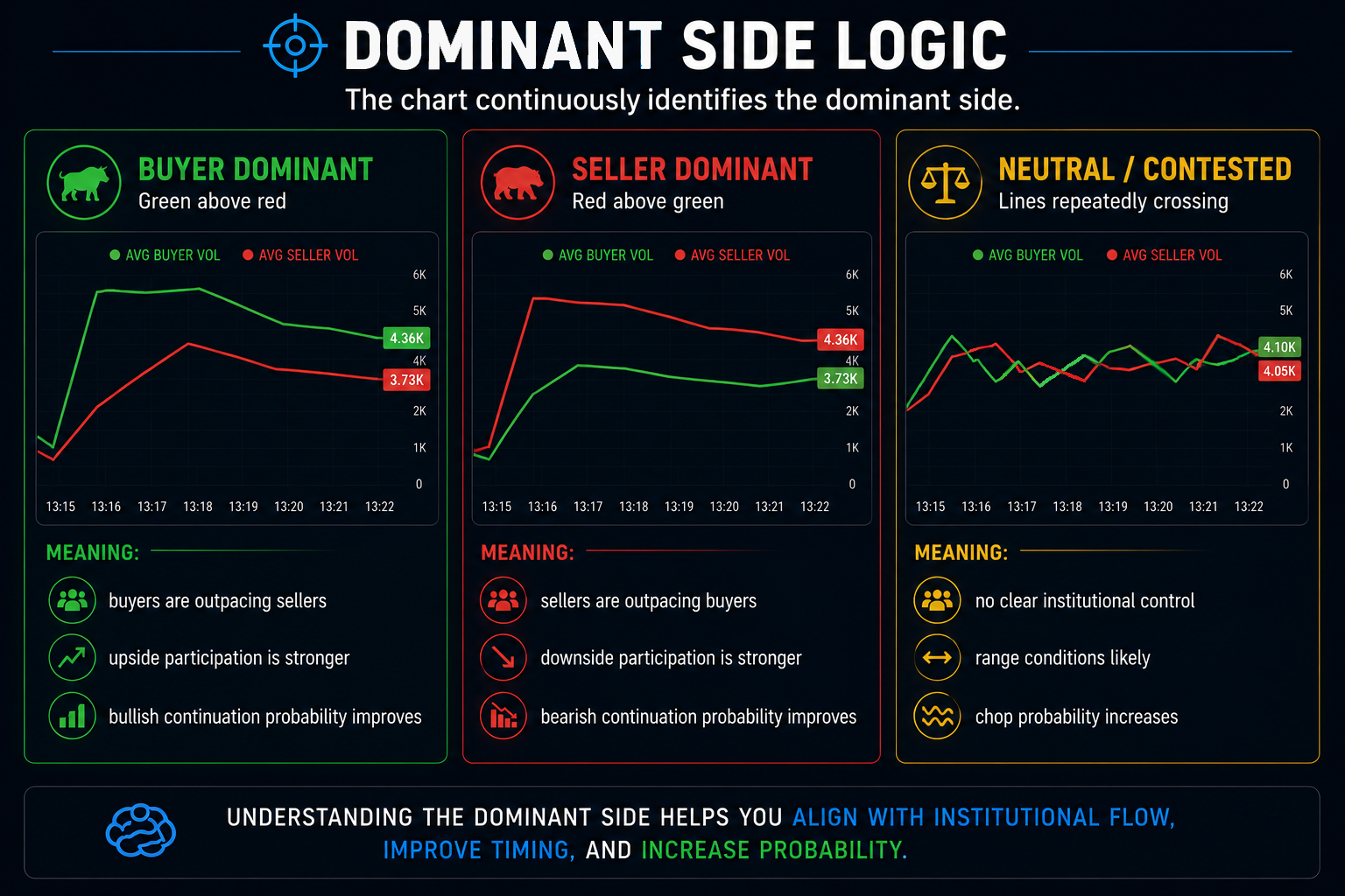
The chart continuously identifies the dominant side.
BUYER DOMINANT
Green above red
Meaning:
- buyers are outpacing sellers
- upside participation is stronger
- bullish continuation probability improves
SELLER DOMINANT
Red above green
Meaning:
- sellers are outpacing buyers
- downside participation is stronger
- bearish continuation probability improves
NEUTRAL / CONTESTED
Lines repeatedly crossing
Meaning:
- no clear institutional control
- range conditions likely
- chop probability increases
🧠 TREND RATIO
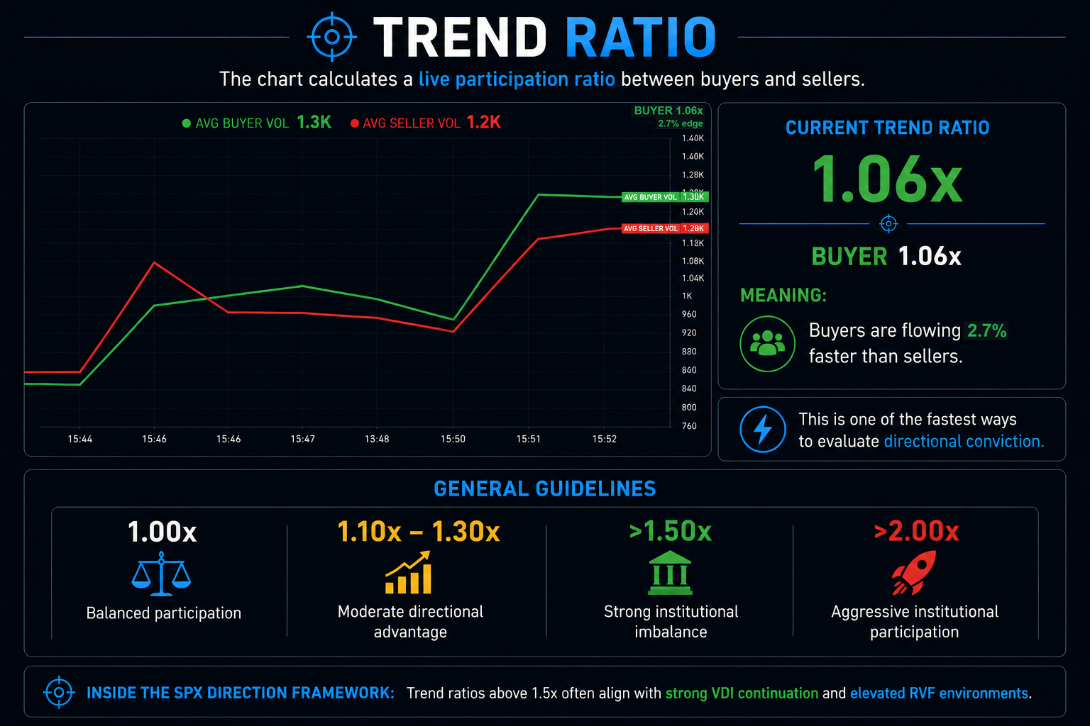
The chart calculates a live participation ratio between buyers and sellers.
Example:
BUYER 1.06x
Meaning:
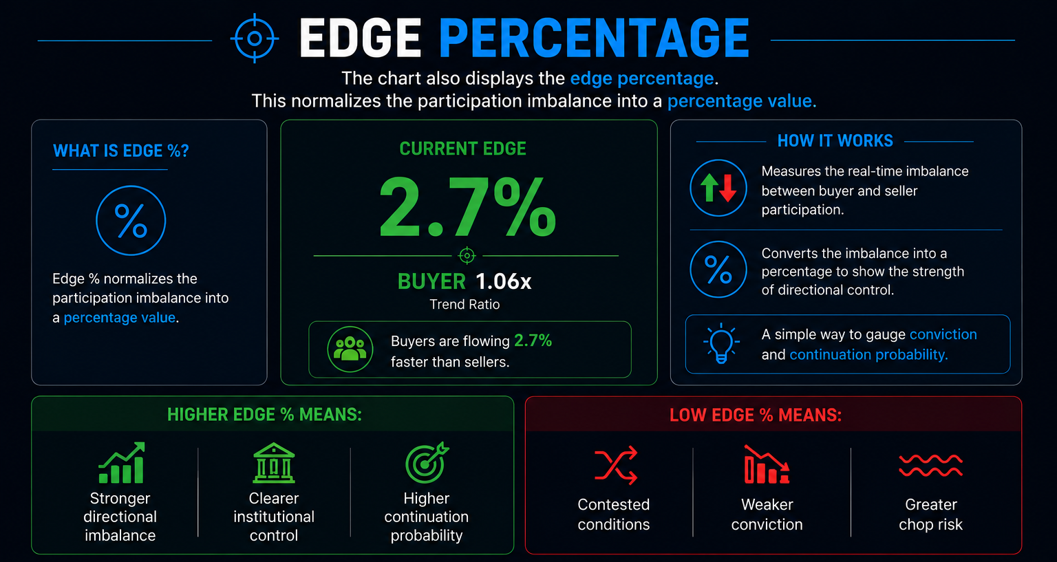
Buyers are flowing 2.7% faster than sellers.
This is one of the fastest ways to evaluate directional conviction.
GENERAL GUIDELINES
1.00x
Balanced participation
1.10x – 1.30x
Moderate directional advantage
>1.50x
Strong institutional imbalance
>2.00x
Aggressive institutional participation
Inside the SPX Direction framework:
Trend ratios above 1.5x often align with strong VDI continuation and elevated RVF environments.
🧠 EDGE PERCENTAGE
The chart also displays the edge percentage.
This normalizes the participation imbalance into a percentage value.
Higher edge % means:
- stronger directional imbalance
- clearer institutional control
- higher continuation probability
Low edge % means:
- contested conditions
- weaker conviction
- greater chop risk
🧠 TIMEFRAME MODES
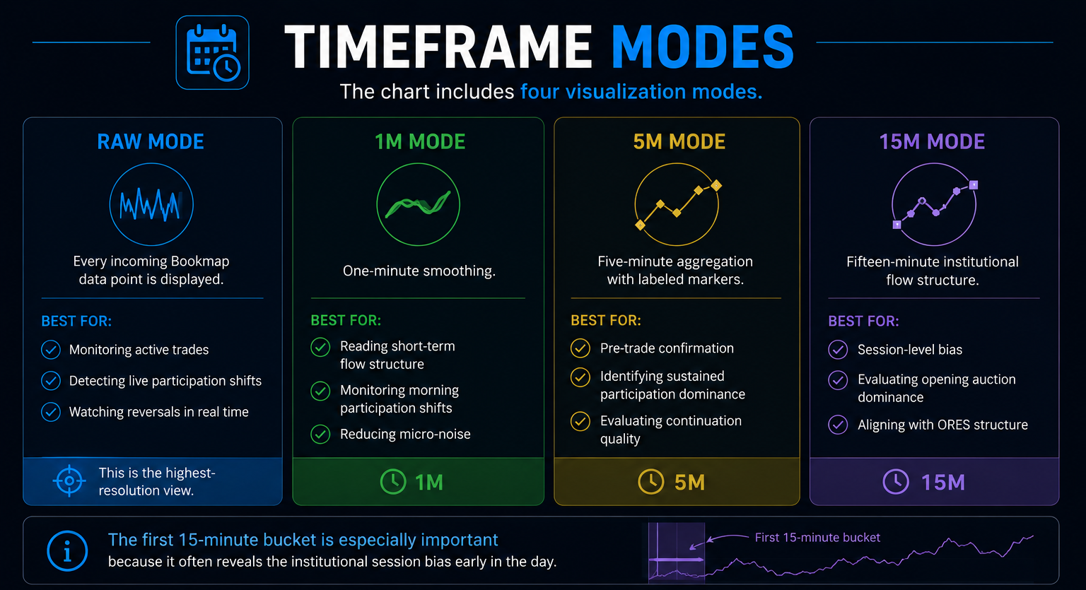
The chart includes four visualization modes.
RAW MODE
Every incoming Bookmap data point is displayed.
Best for:
- monitoring active trades
- detecting live participation shifts
- watching reversals in real time
This is the highest-resolution view.
1M MODE
One-minute smoothing.
Best for:
- reading short-term flow structure
- monitoring morning participation shifts
- reducing micro-noise
5M MODE
Five-minute aggregation with labeled markers.
Best for:
- pre-trade confirmation
- identifying sustained participation dominance
- evaluating continuation quality
15M MODE
Fifteen-minute institutional flow structure.
Best for:
- session-level bias
- evaluating opening auction dominance
- aligning with ORES structure
The first 15-minute bucket is especially important because it often reveals the institutional session bias early in the day.
🧠 HOW TO READ THE SESSION
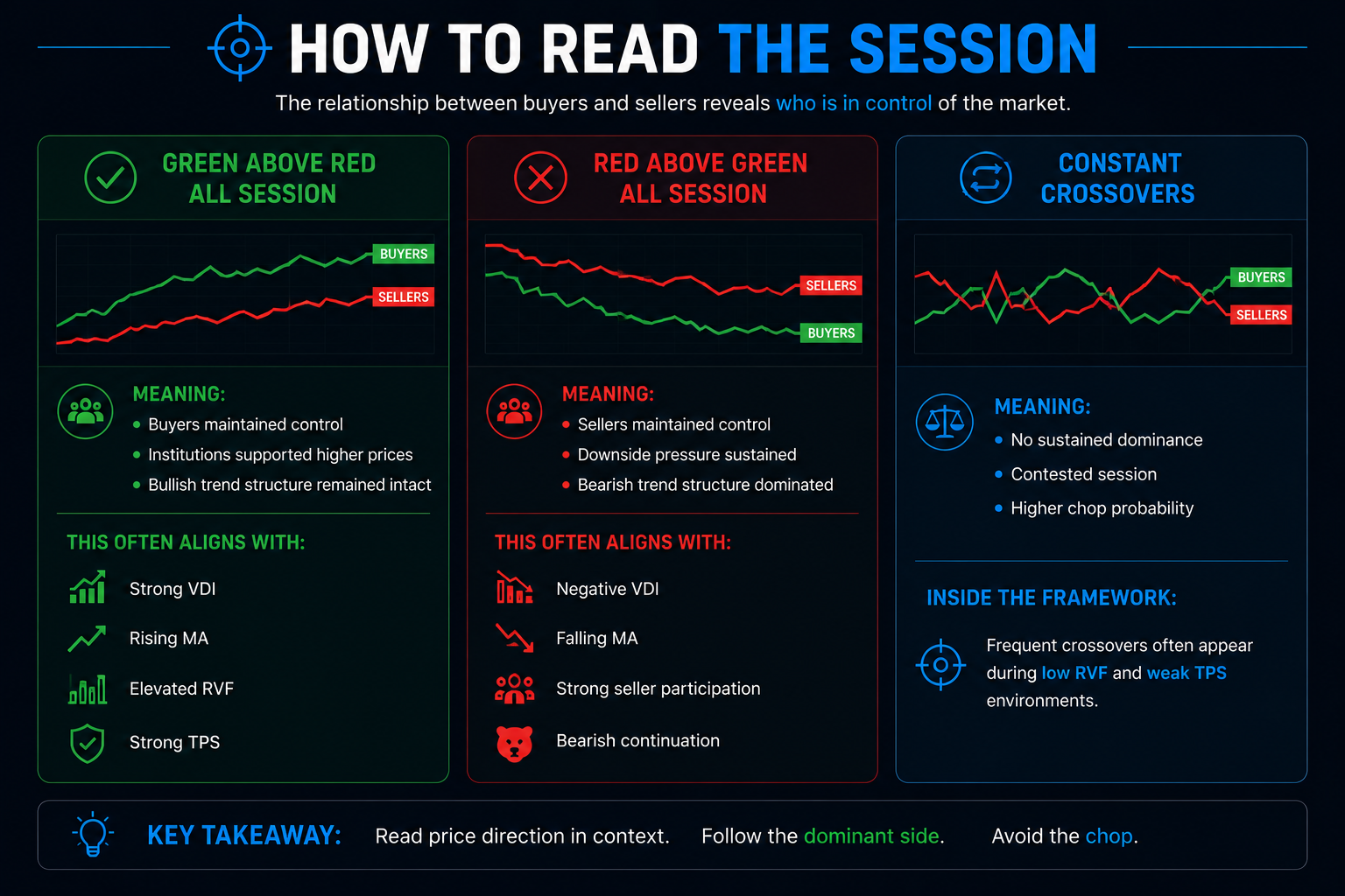
🟢 GREEN ABOVE RED ALL SESSION
Meaning:
- buyers maintained control
- institutions supported higher prices
- bullish trend structure remained intact
This often aligns with:
- strong VDI
- rising MA
- elevated RVF
- strong TPS
🔴 RED ABOVE GREEN ALL SESSION
Meaning:
- sellers maintained control
- downside pressure sustained
- bearish trend structure dominated
This often aligns with:
- negative VDI
- falling MA
- strong seller participation
- bearish continuation
🔄 CONSTANT CROSSOVERS
Meaning:
- no sustained dominance
- contested session
- higher chop probability
Inside the framework:
Frequent crossovers often appear during low RVF and weak TPS environments.
🧠 CROSSOVERS — THE PRIMARY SIGNAL
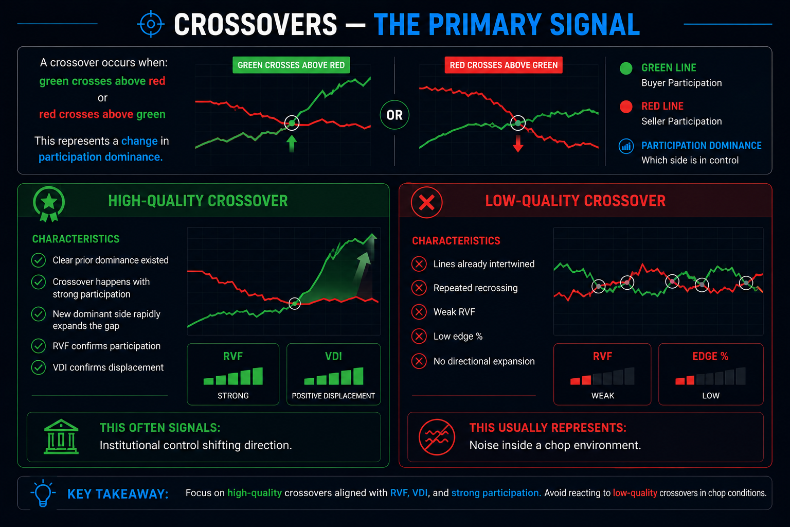
A crossover occurs when:
- green crosses above red
or - red crosses above green
This represents a change in participation dominance.
HIGH-QUALITY CROSSOVER
Characteristics:
- clear prior dominance existed
- crossover happens with strong participation
- new dominant side rapidly expands the gap
- RVF confirms participation
- VDI confirms displacement
This often signals:
institutional control shifting direction.
LOW-QUALITY CROSSOVER
Characteristics:
- lines already intertwined
- repeated recrossing
- weak RVF
- low edge %
- no directional expansion
This usually represents:
noise inside a chop environment.
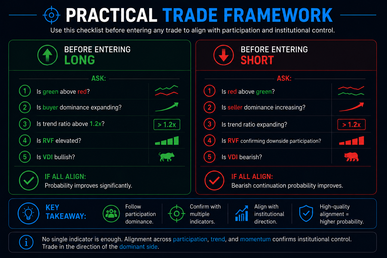
🧠 PRACTICAL TRADE FRAMEWORK
BEFORE ENTERING LONG
Ask:
- Is green above red?
- Is buyer dominance expanding?
- Is trend ratio above 1.2x?
- Is RVF elevated?
- Is VDI bullish?
If all align:
probability improves significantly.
BEFORE ENTERING SHORT
Ask:
- Is red above green?
- Is seller dominance increasing?
- Is trend ratio expanding?
- Is RVF confirming downside participation?
- Is VDI bearish?
If all align:
bearish continuation probability improves.
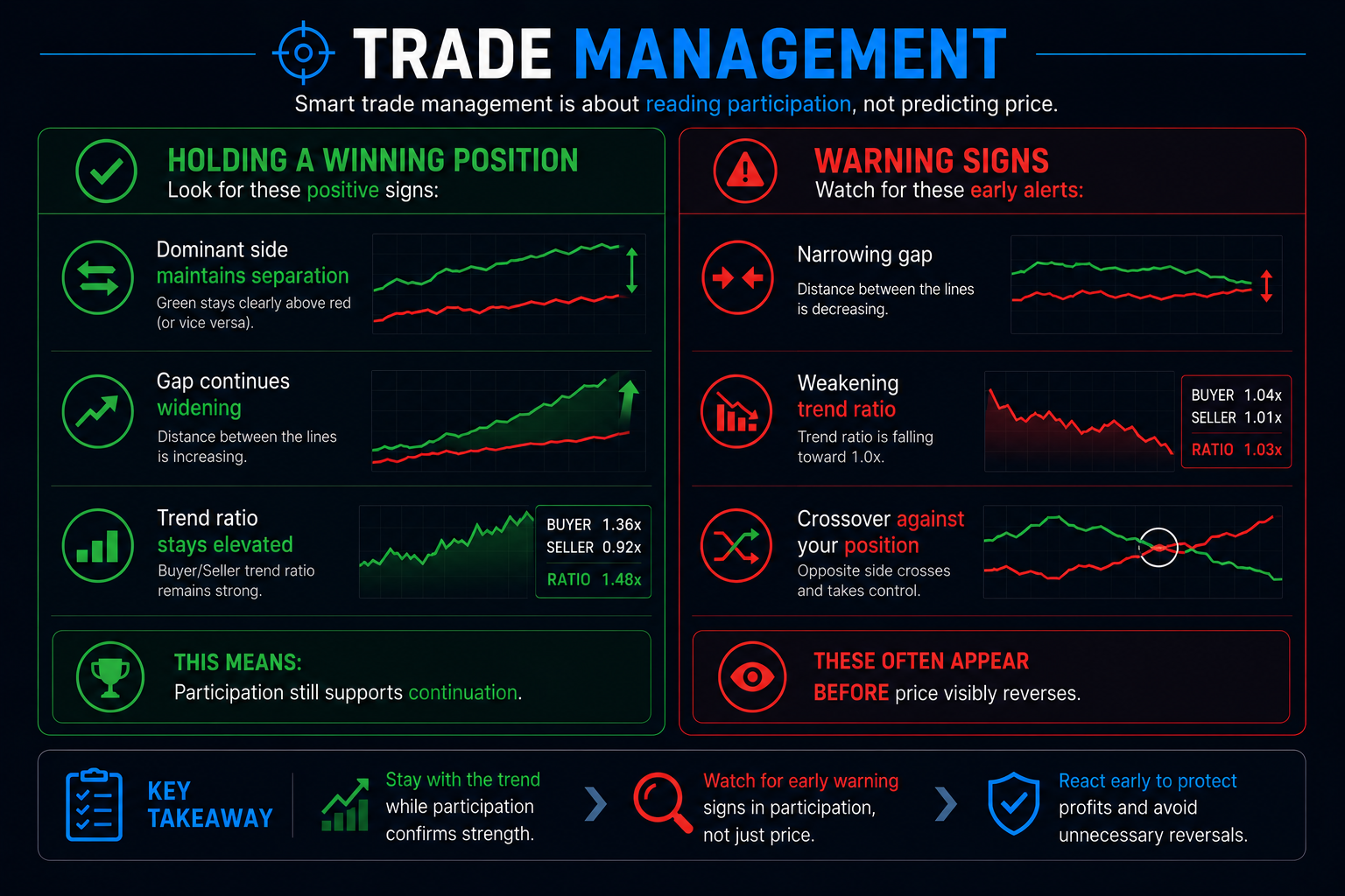
🧠 TRADE MANAGEMENT
HOLDING A WINNING POSITION
Positive signs:
- dominant side maintains separation
- gap continues widening
- trend ratio stays elevated
This means:
participation still supports continuation.
WARNING SIGNS
Watch for:
- narrowing gap
- weakening trend ratio
- crossover against your position
These often appear BEFORE price visibly reverses.
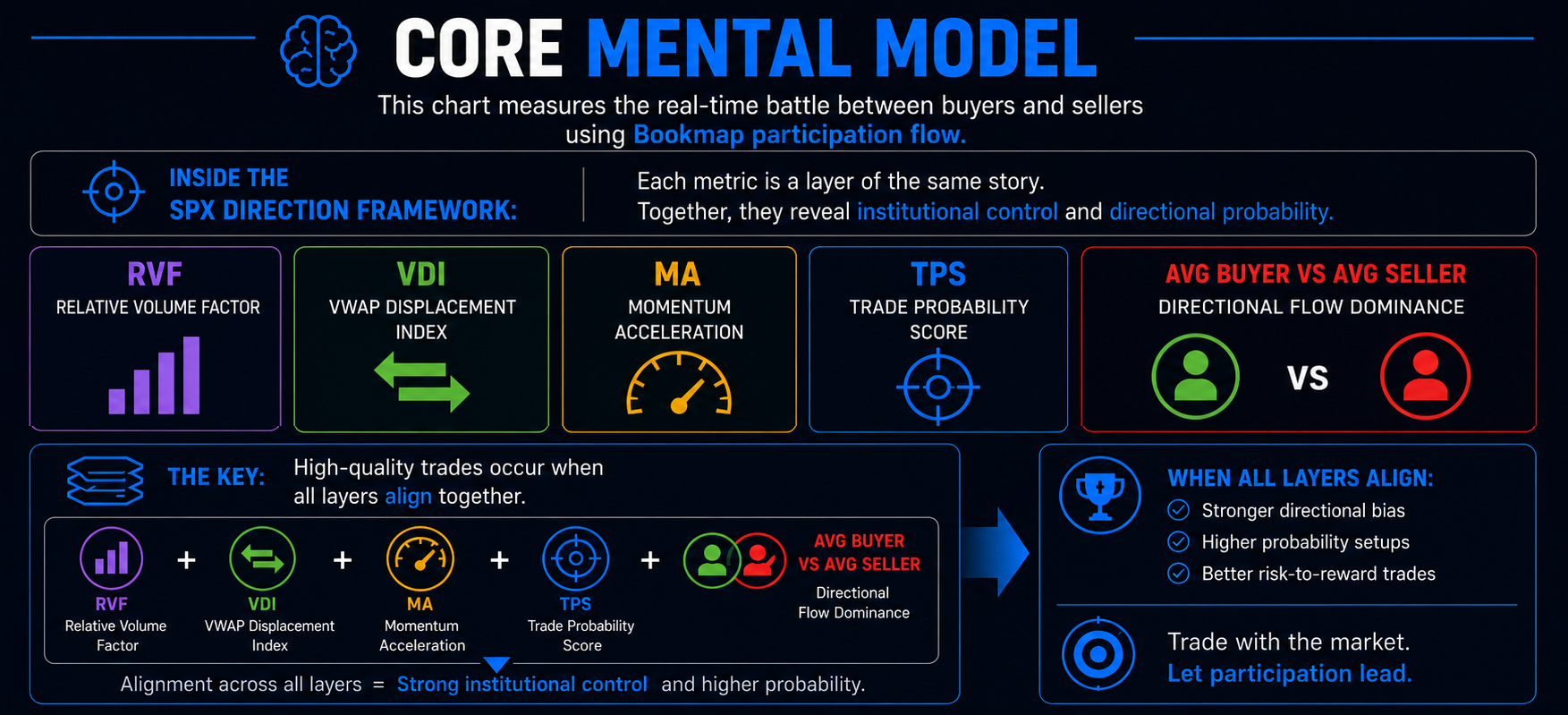
🧠 CORE MENTAL MODEL
This chart measures the real-time battle between buyers and sellers using Bookmap participation flow.
Inside the SPX Direction framework:
- RVF measures participation quality
- VDI measures displacement
- MA measures acceleration
- TPS measures setup probability
- AVG BUYER VS AVG SELLER measures directional flow dominance
High-quality trades occur when all layers align together.