Domination Buyers vs Domination Sellers
Contact customer support at support@spxdirection.com
Domination Buyers vs Domination Sellers
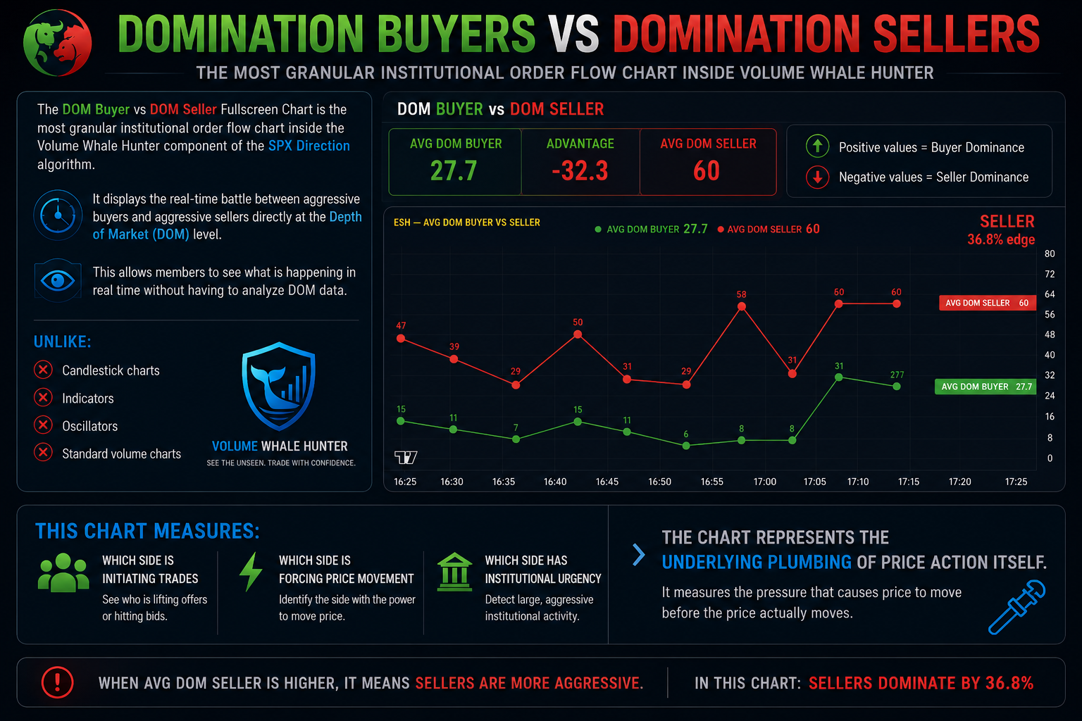
The DOM Buyer vs DOM Seller Fullscreen Chart is the most granular institutional order flow chart inside the Volume Whale Hunter component of the SPX Direction algorithm.
It displays the real-time battle between aggressive buyers and aggressive sellers directly at the Depth of Market (DOM) level. This allows members to see what is happening in real time without having to analyze DOM data.
Unlike:
- Candlestick charts
- Indicators
- Oscillators
- Standard volume charts
This chart measures:
- Which side is initiating trades
- Which side is forcing price movement
- Which side has institutional urgency
The chart represents the underlying plumbing of price action itself.
It measures the pressure that causes price to move before the price actually moves.
The Core Concept — Depth of Market (DOM)
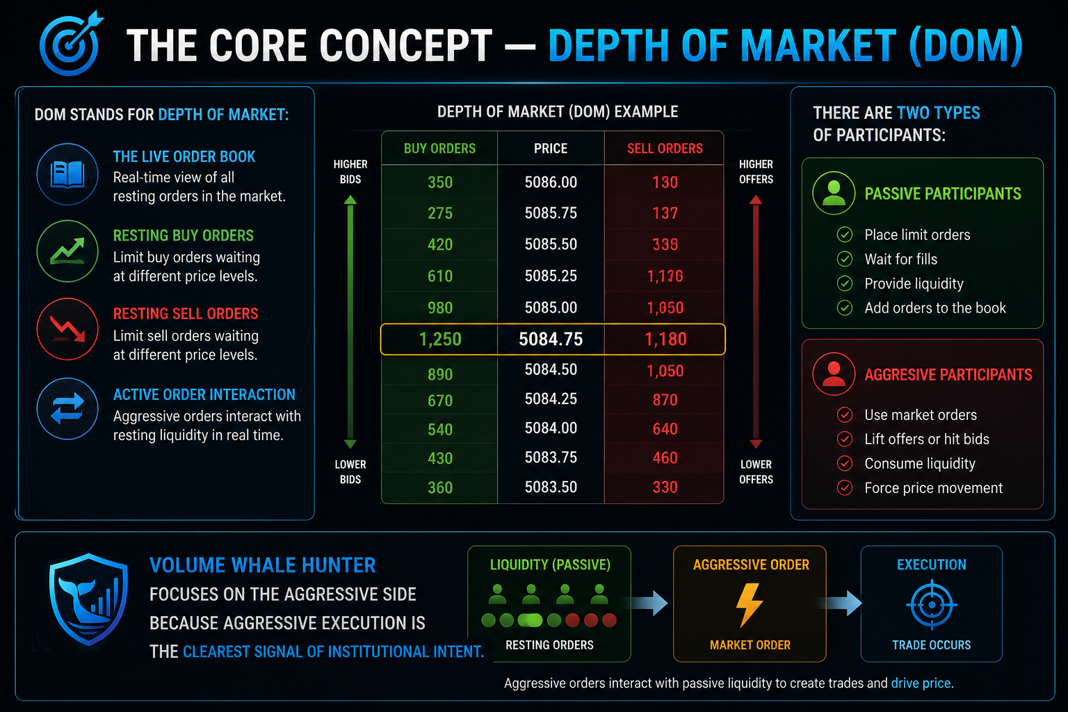
DOM stands for Depth of Market:
- The live order book
- Resting buy orders
- Resting sell orders
- Active order interaction
There are two types of participants:
Passive Participants
- Place limit orders
- Wait for fills
- Provide liquidity
Aggressive Participants
- Use market orders
- Lift offers or hit bids
- Consume liquidity
- Force price movement
Volume Whale Hunter focuses on the aggressive side because aggressive execution is the clearest signal of institutional intent.
What the Two Lines Represent
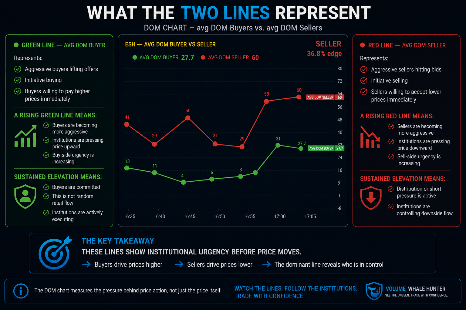
Green Line — AVG DOM BUYER
Represents:
- Aggressive buyers lifting offers
- Initiative buying
- Buyers willing to pay higher prices immediately
A rising green line means:
- Buyers are becoming more aggressive
- Institutions are pressing price upward
- Buy-side urgency is increasing
Sustained elevation means:
- Buyers are committed
- This is not random retail flow
- Institutions are actively executing
Red Line — AVG DOM SELLER
Represents:
- Aggressive sellers hitting bids
- Initiative selling
- Sellers willing to accept lower prices immediately
A rising red line means:
- Sellers are becoming more aggressive
- Institutions are pressing price downward
- Sell-side urgency is increasing
Sustained elevation means:
- Distribution or short pressure is active
- Institutions are controlling downside flow
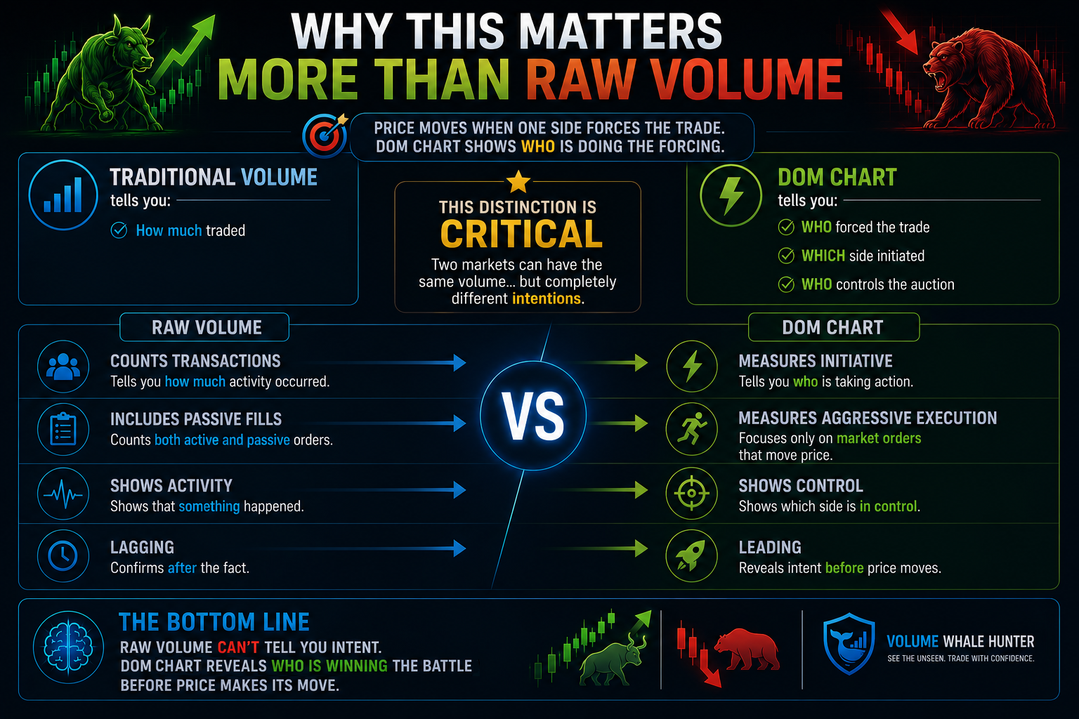
Why This Matters More Than Raw Volume
Traditional volume tells you:
- How much traded
DOM chart tells you:
- WHO forced the trade
- WHICH side initiated
- WHO controls the auction
This distinction is critical.
|
|
|
|
|
|
|
|
|
|
|
|
|
|
|
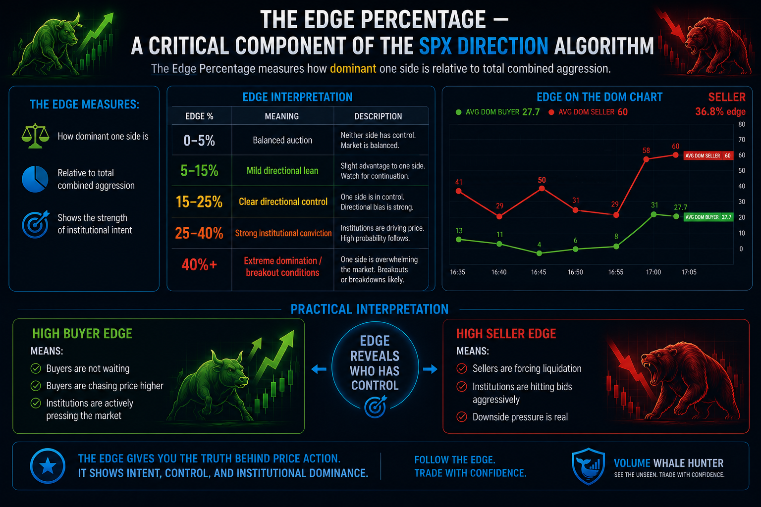
The Edge Percentage — A Critical Component of the SPX Direction Algorithm
Formula:
Edge%=∣DOM Buyer−DOM Seller∣DOM Buyer+DOM Seller×100Edge\% = \frac{|DOM\ Buyer - DOM\ Seller|}{DOM\ Buyer + DOM\ Seller} \times 100Edge%=DOM Buyer+DOM Seller∣DOM Buyer−DOM Seller∣×100
The edge measures:
- How dominant one side is
- Relative to total combined aggression
Edge Interpretation
|
|
|
|
|
|
|
|
|
|
|
|
|
|
|
|
|
|
Practical Interpretation
High Buyer Edge
Means:
- Buyers are not waiting
- Buyers are chasing price higher
- Institutions are actively pressing the market
High Seller Edge
Means:
- Sellers are forcing liquidation
- Institutions are hitting bids aggressively
- Downside pressure is real
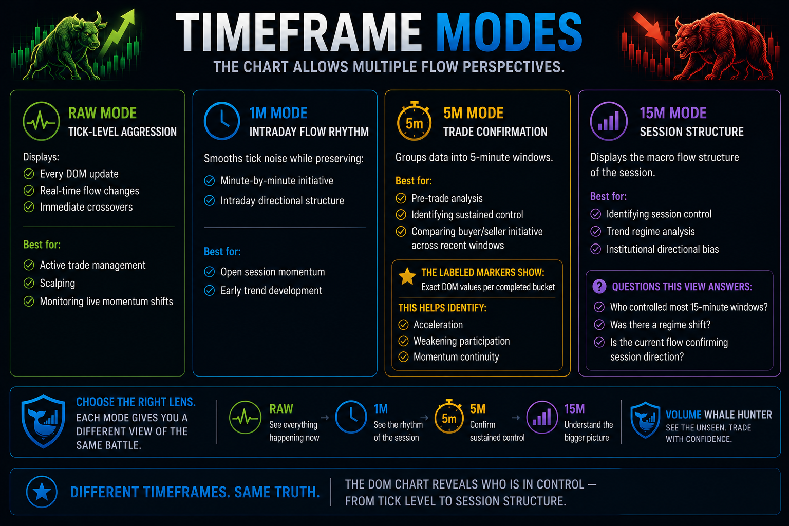
Timeframe Modes
The chart allows multiple flow perspectives.
RAW Mode — Tick-Level Aggression
Displays:
- Every DOM update
- Real-time flow changes
- Immediate crossovers
Best for:
- Active trade management
- Scalping
- Monitoring live momentum shifts
1M Mode — Intraday Flow Rhythm
Smooths tick noise while preserving:
- Minute-by-minute initiative
- Intraday directional structure
Best for:
- Open session momentum
- Early trend development
5M Mode — Trade Confirmation
Groups data into 5-minute windows.
Best for:
- Pre-trade analysis
- Identifying sustained control
- Comparing buyer/seller initiative across recent windows
The labeled markers show:
- Exact DOM values per completed bucket
This helps identify:
- Acceleration
- Weakening participation
- Momentum continuity
15M Mode — Session Structure
Displays the macro flow structure of the session.
Best for:
- Identifying session control
- Trend regime analysis
- Institutional directional bias
Questions this view answers:
- Who controlled most 15-minute windows?
- Was there a regime shift?
- Is the current flow confirming session direction?
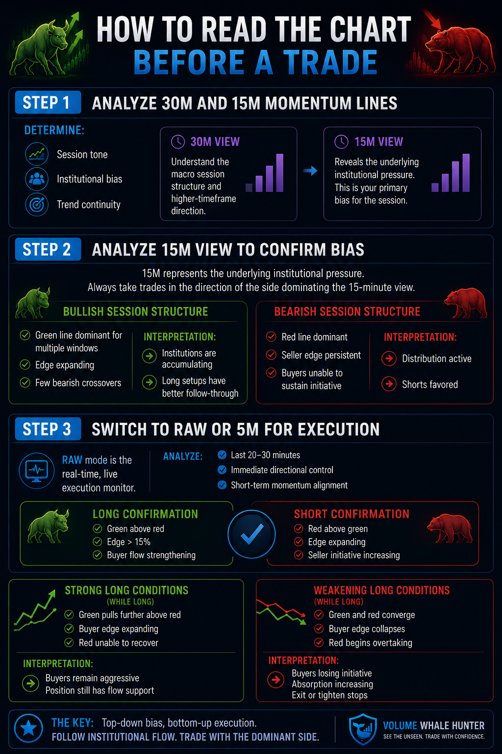
How to Read the Chart Before a Trade
Step 1 — Analyze 30M and 15M Momentum Lines
Determine:
- Session tone
- Institutional bias
- Trend continuity
Step 2 — Analyze 15M View to Confirm Bias
15min represents the underlying institutional pressure. Always take trades in the direction of side dominating the 15-minute view.
Bullish Session Structure
- Green line dominant for multiple windows
- Edge expanding
- Few bearish crossovers
Interpretation:
- Institutions are accumulating
- Long setups have better follow-through
Bearish Session Structure
- Red line dominant
- Seller edge persistent
- Buyers unable to sustain initiative
Interpretation:
- Distribution active
- Shorts favored
Step 3 — Switch to RAW or 5M for Execution
RAW mode is the real time, live execution monitor.
Analyze:
- Last 20–30 minutes
- Immediate directional control
- Short-term momentum alignment
Long Confirmation
- Green above red
- Edge >15%
- Buyer flow strengthening
Short Confirmation
- Red above green
- Edge expanding
- Seller initiative increasing
Strong Long Conditions
While long:
- Green pulls further above red
- Buyer edge expanding
- Red unable to recover
Interpretation:
- Buyers remain aggressive
- Position still has flow support
Weakening Long Conditions
While long:
- Green and red converge
- Buyer edge collapses
- Red begins overtaking
Interpretation:
- Buyers losing initiative
- Absorption increasing
- Exit or tighten stops
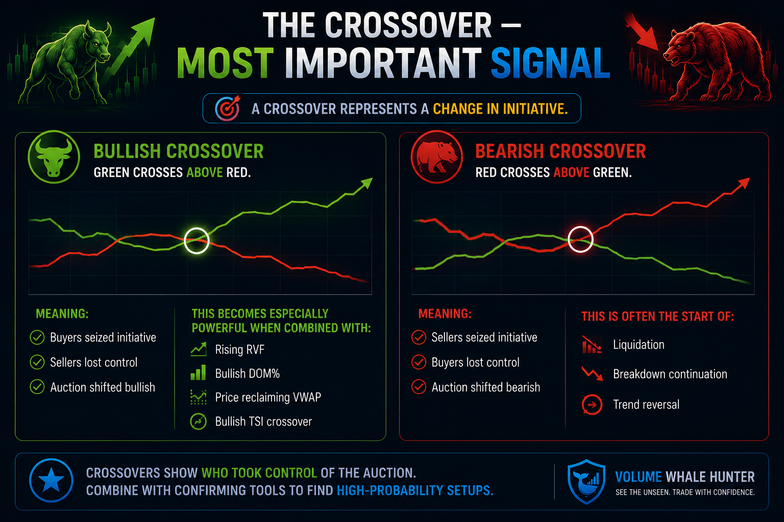
The Crossover — Most Important Signal
A crossover represents:
A change in initiative.
Bullish Crossover
Green crosses above red.
Meaning:
- Buyers seized initiative
- Sellers lost control
- Auction shifted bullish
This becomes especially powerful when combined with:
- Rising RVF
- Bullish DOM%
- Price reclaiming VWAP
- Bullish TSI crossover
Bearish Crossover
Red crosses above green.
Meaning:
- Sellers seized initiative
- Buyers lost control
- Auction shifted bearish
This is often the start of:
- Liquidation
- Breakdown continuation
- Trend reversal
Not All Crossovers Are Equal
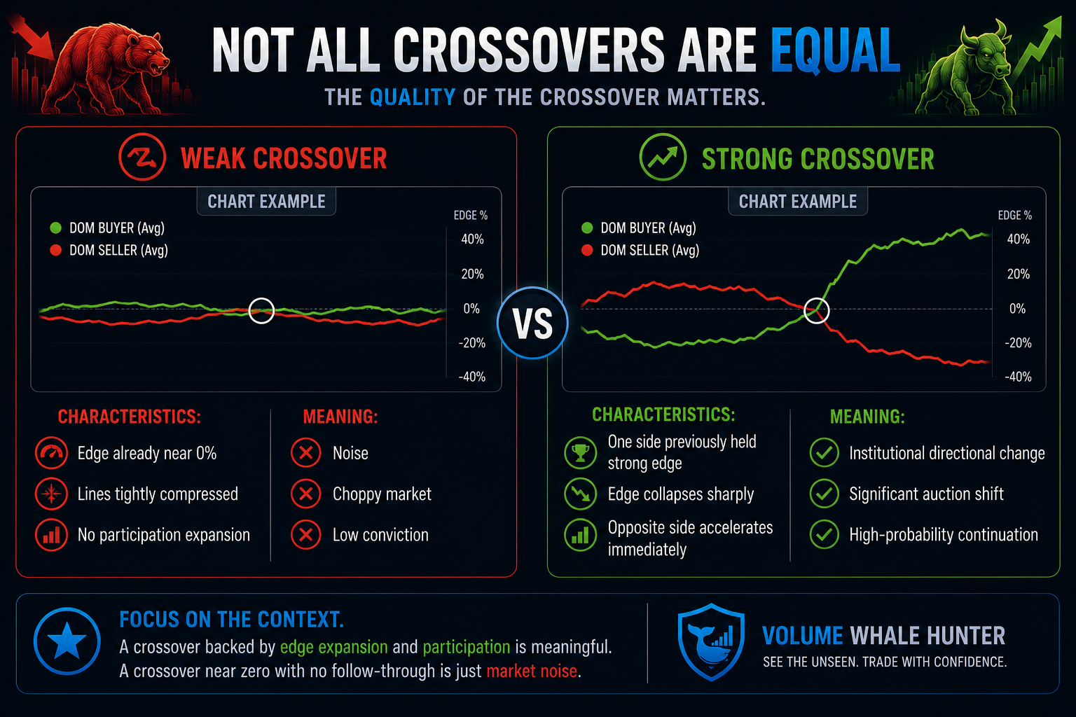
The quality of the crossover matters.
Weak Crossover
Characteristics:
- Edge already near 0%
- Lines tightly compressed
- No participation expansion
Meaning:
- Noise
- Choppy market
- Low conviction
Strong Crossover
Characteristics:
- One side previously held strong edge
- Edge collapses sharply
- Opposite side accelerates immediately
Meaning:
- Institutional directional change
- Significant auction shift
- High-probability continuation
Common Institutional Flow Patterns
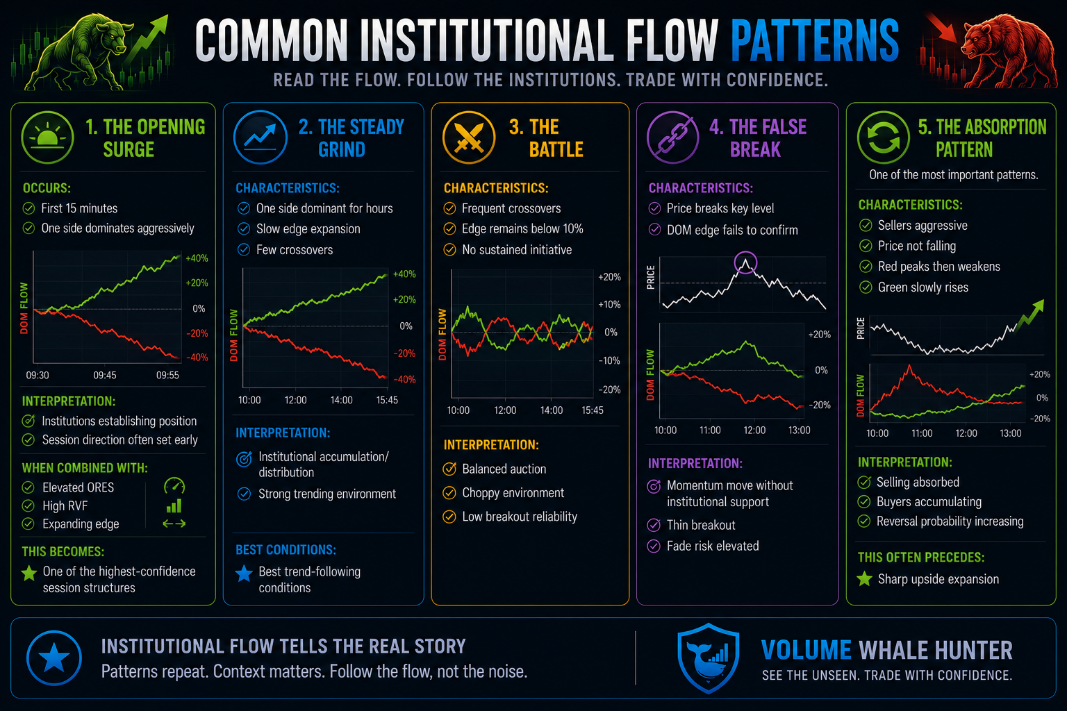
The Opening Surge
Occurs:
- First 15 minutes
- One side dominates aggressively
Interpretation:
- Institutions establishing position
- Session direction often set early
When combined with:
- Elevated ORES
- High RVF
- Expanding edge
This becomes:
- One of the highest-confidence session structures
The Steady Grind
Characteristics:
- One side dominant for hours
- Slow edge expansion
- Few crossovers
Interpretation:
- Institutional accumulation/distribution
- Strong trending environment
- Best trend-following conditions
The Battle
Characteristics:
- Frequent crossovers
- Edge remains below 10%
- No sustained initiative
Interpretation:
- Balanced auction
- Choppy environment
- Low breakout reliability
The False Break
Characteristics:
- Price breaks key level
- DOM edge fails to confirm
Interpretation:
- Momentum move without institutional support
- Thin breakout
- Fade risk elevated
The Absorption Pattern
One of the most important patterns.
Characteristics:
- Sellers aggressive
- Price not falling
- Red peaks then weakens
- Green slowly rises
Interpretation:
- Selling absorbed
- Buyers accumulating
- Reversal probability increasing
This often precedes:
- Sharp upside expansion
Why the Fullscreen View Matters
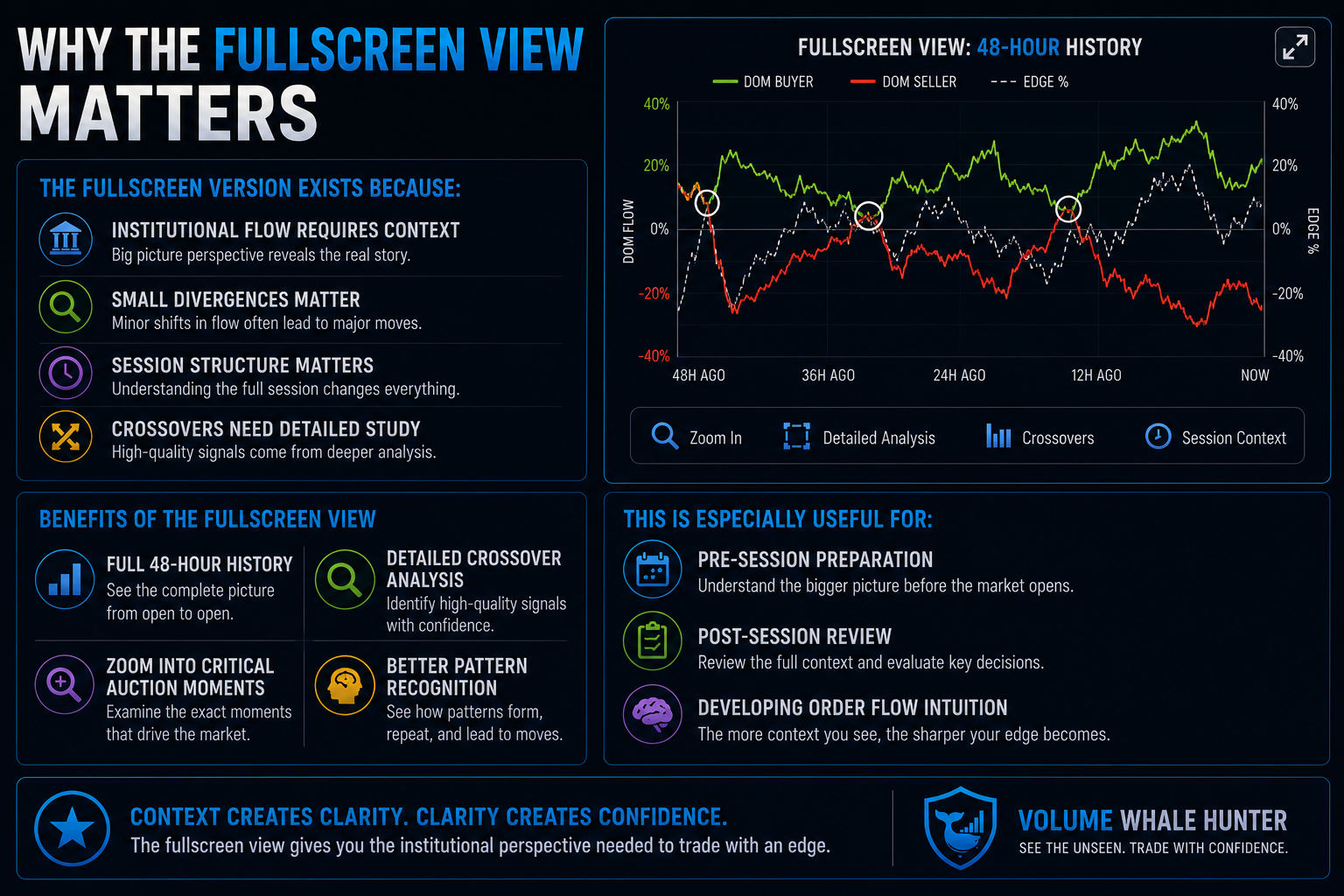
The fullscreen version exists because:
- Institutional flow requires context
- Small divergences matter
- Session structure matters
- Crossovers need detailed study
Benefits:
- Full 48-hour history
- Detailed crossover analysis
- Zoom into critical auction moments
- Better pattern recognition
This is especially useful for:
- Pre-session preparation
- Post-session review
- Developing order flow intuition
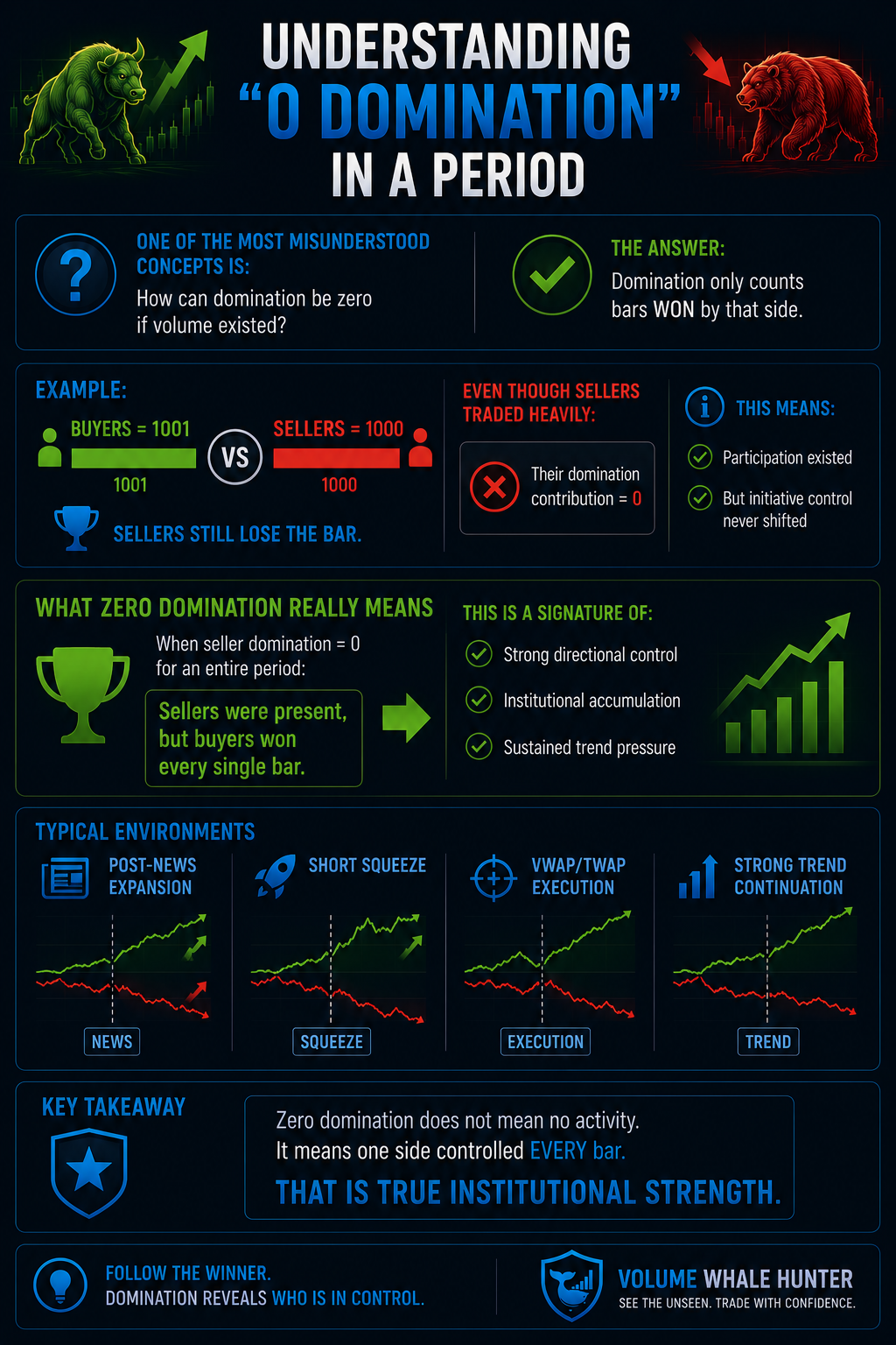
Understanding “0 Domination” in a Period
One of the most misunderstood concepts is:
How can domination be zero if volume existed?
The answer:
- Domination only counts bars WON by that side.
Example:
- Buyers = 1001
- Sellers = 1000
Sellers still lose the bar.
Even though sellers traded heavily:
- Their domination contribution = 0
This means:
- Participation existed
- But initiative control never shifted
What Zero Domination Really Means
When seller domination = 0 for an entire period:
- Sellers were present
- But buyers won every single bar
This is a signature of:
- Strong directional control
- Institutional accumulation
- Sustained trend pressure
Typical environments:
- Post-news expansion
- Short squeeze
- VWAP/TWAP execution
- Strong trend continuation
Final Philosophy
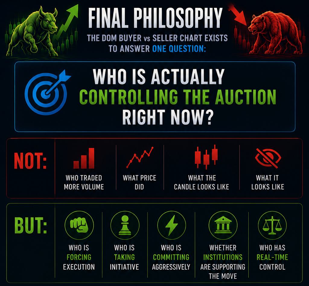
The DOM Buyer vs Seller chart exists to answer one question:
Who is actually controlling the auction right now?
Not:
- Who traded more volume
- What price did
- What the candle looks like
But:
- Who is forcing execution
- Who is taking initiative
- Who is committing aggressively
- Whether institutions are supporting the move
This is the purest institutional order flow signal inside Volume Whale Hunter.